Journal
Texture cues that shoppers meet before they read the ingredient list
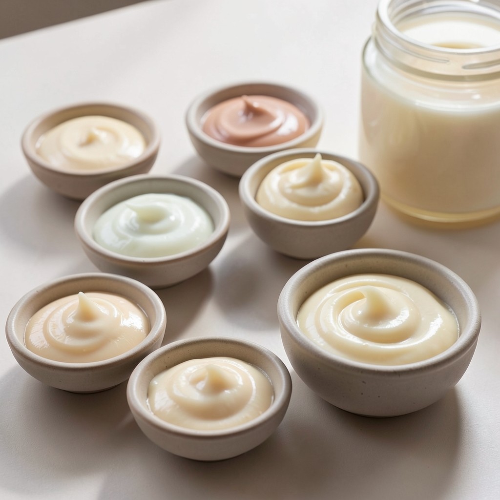
Shoppers often decide whether a personal care product feels right for them before they finish the claim hierarchy. Texture cues on pack and at shelf do that work quietly.
In recent Hanoi observations, translucent jars and soft-gel swatch imagery travelled with lighter day-cream stories, while opaque tubs and dense swirl photography stayed with night or repair roles. The pattern is not universal, but it is consistent enough to notice when your pack fights the bay.
Fragrance language also rides with texture. Soft floral wording near gel-creams reads differently than the same words beside a rich balm. When teams reuse a master claim across textures, shelf adjacency can contradict the story the pack tries to tell.
Before you approve a new texture SKU, place a mock facing beside the two nearest competitors in the intended bay. Ask whether the cue system matches the role you want. Adjusting opacity, swab photography, or viscosity wording is cheaper than correcting a confused launch after trade presentations.